How to Read Cryptocurrency Charts Like a Pro
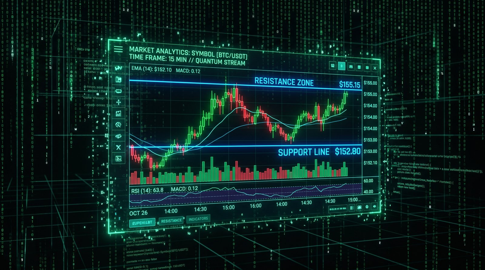
Reading cryptocurrency charts is the most fundamental skill for any trader. Charts are the visual representation of market activity, and the ability to interpret them quickly and accurately separates profitable traders from those who consistently lose money. This guide will teach you how to read crypto charts like a professional, understanding not just what the price is doing but why it is doing it and what is likely to happen next.
Understanding Chart Structure
Every trading chart has three essential components. The horizontal axis represents time, with the most recent price action on the right side. The vertical axis represents price. The chart itself displays the price movement over the selected time period. Understanding this basic structure is the foundation of all chart reading.
Most trading platforms allow you to adjust the time period displayed. Shorter timeframes like one-minute, five-minute, and fifteen-minute charts show detailed price action useful for day trading. Hourly and four-hour charts are popular for swing trading. Daily and weekly charts provide the big picture view preferred by long-term traders. Professional traders analyze multiple timeframes to develop a complete market perspective.
Mastering Candlestick Analysis
Candlestick charts are the industry standard for crypto trading. Each candlestick contains four pieces of information. The opening price is where the candle begins. The closing price is where it ends. The high is the highest price reached during the period and the low is the lowest price. The body of the candle is colored to show whether price increased or decreased during the period.
Individual candlesticks tell a story about the battle between buyers and sellers. A long green body indicates strong buying pressure, with buyers in control throughout the period. A long red body indicates strong selling pressure. Small bodies indicate indecision, with neither buyers nor sellers able to establish control. Long wicks indicate that price moved significantly in one direction but was rejected, showing weakness in that direction.
Key Candlestick Patterns
Single Candlestick Patterns
The doji forms when the open and close are nearly equal, creating a very small body. Doji candles indicate indecision and often precede reversals. The hammer forms during a downtrend and has a small body with a long lower wick, suggesting that sellers pushed price down but buyers stepped in and drove it back up. The shooting star forms during an uptrend and has a small body with a long upper wick, indicating that buyers pushed price up but sellers took control and drove it back down.
Multi-Candlestick Patterns
The engulfing pattern consists of two candles. A bullish engulfing forms when a small red candle is followed by a larger green candle that completely engulfs the previous candle's body. A bearish engulfing is the opposite. These patterns indicate a significant shift in momentum and are among the most reliable reversal signals.
The morning star is a three-candle pattern that signals a bullish reversal, consisting of a long red candle, a small indecisive candle, and a long green candle. The evening star is its bearish counterpart. These patterns are particularly significant when they occur at key support or resistance levels after a sustained trend.
Understanding Market Structure
Market structure refers to the pattern of highs and lows that defines the trend. In an uptrend, price makes higher highs and higher lows. The trend line connecting the higher lows acts as support. In a downtrend, price makes lower highs and lower lows, with the trend line connecting the lower highs acting as resistance. In a range-bound market, price oscillates between a defined support and resistance level.
Identifying market structure is the first step in any trade analysis. Always trade in the direction of the larger trend. If the daily chart shows an uptrend, focus on buying opportunities on lower timeframes. Fighting the larger trend is one of the most common and costly mistakes traders make. Market structure provides the context that makes all other analysis more meaningful.
Volume Analysis
Volume is displayed as bars at the bottom of most trading charts. It shows the number of units traded during each period. Volume confirms the validity of price movements. A breakout accompanied by high volume is more likely to succeed than one on low volume. Volume should increase in the direction of the trend — rising volume in uptrends confirms buying pressure, while rising volume in downtrends confirms selling pressure.
Volume patterns provide additional insights. Volume spikes often indicate climax buying or selling, which may signal an impending reversal. Declining volume during a trend suggests the trend is losing momentum. Volume analysis helps you distinguish between genuine market movements and false signals that can trap inexperienced traders.
Timeframe Analysis
Professional traders analyze multiple timeframes before making a trade. The higher timeframe provides the overall trend direction. The intermediate timeframe helps identify the current market phase. The lower timeframe is used for precise entry and exit timing. A typical approach uses the daily chart for trend, the four-hour chart for trade identification, and the fifteen-minute chart for execution.
Aligning your trades with the trend on higher timeframes significantly improves your probability of success. If the daily trend is bullish, look for buying opportunities on the lower timeframes when price pulls back to support. If the daily trend is bearish, focus on selling or shorting opportunities on bounces to resistance. This multi-timeframe approach ensures that your trades are aligned with the larger market forces.
Support and Resistance Identification
Support and resistance levels are the most important concepts in chart reading. Horizontal support and resistance form at price levels where the market has reversed multiple times in the past. Dynamic support and resistance are provided by moving averages and trend lines. Psychological levels — round numbers like ten thousand, fifty thousand, or one hundred thousand — also act as significant support and resistance.
The more times a level has been tested, the stronger it becomes. When a level breaks, its role often reverses. A broken resistance level becomes support, and a broken support level becomes resistance. This concept of role reversal helps traders identify where stop-losses cluster and where price is likely to react. Marking key levels on your charts helps you anticipate market behavior and plan your trades accordingly.
Order Flow and Liquidity
Understanding order flow takes chart reading to the next level. Large buy and sell orders create support and resistance levels. Stop-loss orders cluster above resistance and below support, creating liquidity zones. When price breaks through a key level, it often accelerates as stop-loss orders are triggered, providing the fuel for breakout moves.
Professional traders look for liquidity grabs — price movements that temporarily break through a key level to trigger stop-losses before reversing. These moves often appear as long wicks on candlestick charts. Recognizing liquidity grabs helps you avoid being stopped out of positions prematurely and can provide high-probability entry opportunities when the market reverses after a liquidity sweep.
Developing Your Chart Reading Routine
Professional chart reading follows a systematic routine. Start with the highest timeframe to determine the overall trend. Move down to the intermediate timeframe to identify the current market phase and potential trade setups. Finally, use the lowest timeframe for precise entry and exit placement. Mark key support and resistance levels on all timeframes.
Record your analysis and review its accuracy over time. This practice helps you identify your strengths and weaknesses. Over time, chart reading becomes an intuitive skill. You will develop the ability to glance at a chart and immediately understand the market structure, trend, key levels, and potential trading opportunities. This skill is the foundation of all successful trading.
Conclusion
Reading cryptocurrency charts is a skill that improves with consistent practice. Start by mastering the basics — candlestick patterns, market structure, volume analysis, and support and resistance. Gradually incorporate more advanced concepts like multi-timeframe analysis and order flow dynamics. Develop a systematic routine for analyzing charts before every trade.
The most successful traders are not those who use the most complex analysis but those who have mastered the fundamentals and apply them consistently. Commit to practicing your chart reading skills daily. Review your analysis regularly and learn from both your successes and mistakes. With dedication and practice, you will develop the ability to read crypto charts with the confidence and accuracy of a professional trader.